Sales Dashboard Project
This project aimed to develop an Excel Sales Dashboard that transforms raw sales data into actionable business insights for better strategic decision making.
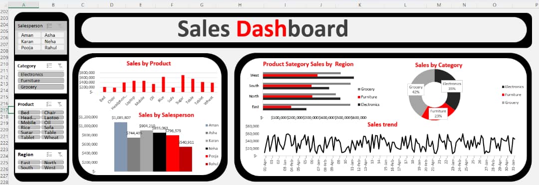
Problem Sales organizations often generate large volumes of transactional data across multiple products, categories, regions, and sales representatives. Without an interactive reporting system, it becomes difficult to monitor performance, identify top-performing salespeople, analyze product demand, and track sales trends over time. This project aimed to develop an Excel Sales Dashboard that transforms raw sales data into actionable business insights for better strategic decision making.
Key business questions addressed include:
- Which products generate the highest sales?
- Which sales representatives contribute the most revenue?
- How do sales vary across different product categories and regions?
- What percentage of total sales comes from each category?
- What trends can be observed in daily sales performance?
Process
-
Imported the sales dataset into Microsoft Excel.
-
Cleaned and prepared the data by removing duplicates, handling missing values, and formatting dates and numerical fields.
-
Created Pivot Tables to summarize sales by:
- Product
- Salesperson
- Product Category
- Region
- Sales Date
- Designed KPI-driven visualizations, including:
- Sales by Product (Column Chart)
- Sales by Salesperson (Bar Chart)
- Product Category Sales by Region (Horizontal Bar Chart)
- Sales by Category (Doughnut Chart)
- Daily Sales Trend (Line Chart)
-
Added interactive slicers for: -Salesperson -Product Category -Product -Region
-
Connected all Pivot Tables and charts to the slicers to enable dynamic filtering across the dashboard.
-
Applied a clean, professional dashboard layout with consistent formatting, colors, and chart alignment to improve readability and user interaction.
Lessons Learned • Clean and well-structured data is the foundation of reliable business reporting. • Pivot Tables and Pivot Charts make it easy to summarize and analyze large datasets. • Interactive slicers improve dashboard usability by allowing users to explore data from multiple perspectives. • Sales trend analysis helps identify seasonal patterns and fluctuations in business performance. • Comparing sales by product, region, and salesperson reveals high-performing areas and opportunities for improvement. • Effective dashboard design enhances communication by presenting complex information in a clear and visually appealing format. • Microsoft Excel is a powerful business intelligence tool capable of producing interactive dashboards for performance monitoring and decision making.
Skills Demonstrated -Microsoft Excel -Data Cleaning and Preparation -Pivot Tables -Pivot Charts -Interactive Dashboard Development -Sales Performance Analysis -Trend Analysis -KPI Reporting -Data Visualization -Business Intelligence -Analytical and Data-Driven Decision Making