Adidas Sales Dashboard
The objective of this project was to develop an interactive Excel dashboard that provides a comprehensive overview of sales performance, enabling stakeholders to track regional performance, evaluate retailer contributions, analyze product sales, and understand customer purchasing channels for informed business decisions.
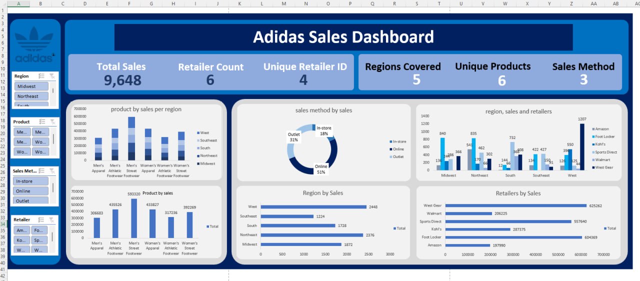
Problem Adidas operates across multiple regions, retailers, product categories, and sales channels, making it challenging to monitor sales performance and identify key revenue drivers. The objective of this project was to develop an interactive Excel dashboard that provides a comprehensive overview of sales performance, enabling stakeholders to track regional performance, evaluate retailer contributions, analyze product sales, and understand customer purchasing channels for informed business decisions.
Key business questions addressed include: • Which products generate the highest sales? • Which regions contribute the most to overall revenue? • Which retailers drive the highest sales? • What is the most effective sales method? • How do product sales vary across different regions?
Process
-
Imported and explored the Adidas sales dataset in Microsoft Excel.
-
Cleaned and prepared the data by removing duplicates, correcting inconsistencies, and formatting fields appropriately.
-
Created Pivot Tables to summarize sales by:
- Product
- Region
- Retailer
- Sales Method
- Designed KPI cards to display:
- Total Sales
- Retailer Count
- Unique Retailer ID
- Regions Covered
- Unique Products
- Sales Methods
- Built interactive Pivot Charts, including:
- Product sales by region
- Sales distribution by sales method
- Regional sales by retailer
- Overall product sales
- Regional sales performance
- Retailer sales comparison
- Added slicers for:
- Region
- Product
- Sales Method
- Retailer
- Designed a professional dashboard layout with consistent formatting, color themes, and interactive filtering to improve user experience.
Lessons Learned • Proper data cleaning improves the accuracy and reliability of dashboard insights.
• Pivot Tables and Pivot Charts are powerful tools for summarizing large datasets efficiently.
• Interactive slicers make dashboards more user-friendly by allowing stakeholders to explore data dynamically.
• KPI cards provide quick visibility into key business metrics and overall performance.
• Sales performance varies significantly across products, retailers, regions, and sales channels, highlighting opportunities for targeted business strategies.
• Effective dashboard design enhances decision-making by presenting complex data in a simple and visually appealing format.
• Excel can be used to build professional business intelligence dashboards without requiring advanced BI tools.
Skills Demonstrated -Microsoft Excel -Data Cleaning and Preparation -Pivot Tables -Pivot Charts -Dashboard Design -KPI Development -Data Visualization -Sales Performance Analysis -Business Intelligence -Interactive Reporting -Analytical and Data-Driven Decision Making